
Background
Let’s say you are a Local Government who is in the process of refreshing your strategic plan. There are several ways to procced with the most dramatic being a complete restart with a blank piece of paper. However, this option implies a commitment to a significant period of restructuring your internal organisation to align your teams, data and process to your new goals and outcomes (potentially).
Likely there is already significant work or projects under way that already have cost and resource implications. You don’t want halt all those projects and go in a completely new direction because the short-term loss likely doesn’t justify the long-term gain, especially if you are already stretched for resources.
Your second option then is to steer the ship from where you are to where you want to be, recognizing that some of what you are doing works and other parts not so much.
Great! Where do we start in seeing what works and what doesn’t? Local Governments tend to generate a lot of strategic information and documents; everything from evidence bases, to local plans, regeneration plans, action plans, plan plans, etc. That’s fine, we can read them all and pick out the ones that align with our current strategy and redo the rest! Yay! We reached a solution.
The Problem
Once you start collecting relevant information you find there are almost 117 documents to review. Each is dozens of pages long. If we assume that each is 24 pages that is about 2,800 pages to read. Yikes! It will take you ages to troll though that in detail to identify relevant themes, let alone the documents that are much longer, such as local plans that can reach 80 to 120 pages easily.
If I have limited time to review all documents, is there an analysis I can perform to understand which documents are ‘more’ relevant semantically? That might direct my time most effectively while giving me an overall sense of how closely aligned my documents are.
The Solution
In this case we can turn to text analysis to assist us. Searching for what documents are relevant is similar to what Google does when you enter a search term. This branch of text analysis is called topic modelling, and for a very effective visual representation of how this works I recommend Rand Fishkin’s blog post on correlating Google’s search results with popular topic modelling algorithms.
So let’s try it out! Where possible I will put sections in Italics to represent long boring explanations. If you want to skip those I will not be offended :)
The Method
Getting the Data
First we need a data set of work from. I compiled a list of all strategic documents in Google Sheets using a web crawler, however there were items the algorithm missed due to a lack of implimnetation and testing time, so certain documents were added manually. Below is the working code for it done in Python.
Yes I still work in Python 2, but am getting there with 3!
#Python 2.7.1

import requests
import time
from bs4 import BeautifulSoup, SoupStrainer

r = requests.get([YOUR LINK])

soup = BeautifulSoup(r.content)

for link in BeautifulSoup(r.text,
        parseOnlyThese=SoupStrainer('a')):
    if link.has_attr('href'):
    if 'pdf' in str(link):
        image_file = open(os.path.join([YOUR DIRECTORY]',
        os.path.basename(link['href'])), 'wb')
        for chunk in r.iter_content(100000):
            image_file.write(chunk)
            image_file.close()
Because topic modelling is a somewhat subjective analysis based on the messy study of linguistics, I added columns for classification as per the client’s request, that would reflect areas the council were accustom to seeing. This will allow us to group documents together later. The client also helped cull unnecessary documents getting use down to the number we currently have.
Quick note, this data has been ammonized to remove references to any actual local government.
Getting the Text
Now we need text to analyse. This was the trickiest part of the analysis as we need two things; A script that will crawl the links to documents and a second one two extract and clean the text. I will be honest, I ended up doing a lot of this manually as the text crawler script I used could not cope with some of the PDF links. But what I was working from is below.
#Python 2.7.1

import urllib2
import BeautifulSoup
import re
import pandas as pd

text=[]
Newlines = re.compile(r'[\r\n]\s+')
data=pd.read_csv([YOUR FILE])
def getPageText(url):
    # given a url, get page content
    data = urllib2.urlopen(url).read()
    # parse as html structured document
    bs = BeautifulSoup.BeautifulSoup(data,
      convertEntities=BeautifulSoup.BeautifulSoup.HTML_ENTITIES)
    # kill javascript content
    for s in bs.findAll('script'):
        s.replaceWith('')
    # find body and extract text
    txt = bs.find('body').getText('\n')
    # remove multiple linebreaks and whitespace
    return Newlines.sub('\n', txt)

def main():
    urls = [data$[URL COLUMN]
    txt = [getPageText(url) for url in urls]
    Text = txt.append(Text)

if __name__=="__main__":
    main()
This text was extracted raw with only minimal cleaning. The text was processed as UTF-8 with all non-conforming characters replaced with blanks. Because this is an English language analysis, most alphanumeric characters have an analogue in other encoding systems (Character such as @,£,-,’,: and so on, where more likely to be removed). The assumption made is that characters removed across documents would appear in similar settings as naming and wording conventions should be similar, thereby minimalizing the loss.
The Analysis
The output was saved in a .csv which was then was loaded into R for analysis. Strings were coerced again to ensure they were uniform. Some documents did not have text due to publishing timelines as well as difficulty in processing and those were also removed. As for the method, credit to Bodong Chen and this blog post about using Latent Sematic Analysis in R. I used much of his method to make my analysis possible. I will do my best to plain English annotate what is happening so that you can you dear reader can follow along.
# Required Packages
library(shiny)
library(tm)
library(ggplot2)
library(lsa)
library(readr)
library(stringr)
library(ggsn)
library(plotly)

# Pre-Pre Process Text
Result<-Result[!is.na(Result$Text),]
Result <- Result[ c("Classification","Document","Text") ]
The R package tm_map, a text mining and text processing package, was used for text preparation. The Corpus command converts documents (titles and text) into a collection of text within a singular object. A corpus is used in many text analysis projects as a standard and simple way to store collections such as this. To make the analysis more relevant we again subject the corpus to cleaning, removing punctuation, stop words (determiners, common words and those that have no inherent context such as ‘is’,‘the’,‘and’,etc.). This removed the ‘noise’ from the analysis so we are comparing substantive text (adverbs, verbs, nouns, etc.).
# Build a Corpus
corpus <- Corpus(VectorSource(Result$Text))
corpus <- tm_map(corpus, tolower)
corpus <- tm_map(corpus, removePunctuation)
corpus <- tm_map(corpus, function(x) removeWords(x, stopwords("english")))
corpus <- tm_map(corpus, stemDocument, language = "english")
corpus # check corpus
## <<SimpleCorpus>>
## Metadata: corpus specific: 1, document level (indexed): 0
## Content: documents: 117Now the heavy lifting starts. In a process referred to as Multi-Dimensional Scaling (MDS) we covert our corpus into a matrix. Rows = words by columns = documents. In our case, 331,338 words by 49 documents. Each word is given a frequency for its appearance by document. Now that we have the raw term matrix we need a way to make them comparable.
Example: Imagine you have two documents. One is 100 pages and one is 10, both about similar subjects, and the word you are looking for is “growth.” We can assume that the 100 page document has a greater chance of having a high frequency of the word “growth.” So if we are comparing our documents on frequency alone we might say they are dissimilar. But that is unfair. We need to compare the relative appearences of words by documents in order to look at similarity. If both our documents have “growth” appear in 10% of all words, we are comparing apples to apples.
# Create a Distance Matrix
td.mat <- as.matrix(TermDocumentMatrix(corpus))
The R lsa package gives us many weighting options in two categories; local weighting and global weighting. We are in fact going to multiply by both to ensure a more unbiased result. Honestly, after much searching it was hard to find definitive answers on which to use. Below offer my humble opinions of each weighting method. Feel free to skip this next bit if it is to much detail.
# Multidimensional Scaling with Latent Semantic Analaysis
td.mat.lsa <- lw_bintf(td.mat) * gw_gfidf(td.mat) # weighting
lsaSpace <- lsa(td.mat.lsa) # create LSA space
dist.mat.lsa <- dist(t(as.textmatrix(lsaSpace))) # compute distance matrix
head(dist.mat.lsa,100) # check distance mantrix
## [1] 32.57576 28.64380 50.63469 34.57704 37.48881 54.49891 41.66599 61.41389
## [9] 33.76428 44.19097 42.53705 52.83014 46.14660 50.39423 61.41389 61.41389
## [17] 42.46248 40.12651 36.13213 54.31993 51.13785 52.23854 51.75914 65.45626
## [25] 58.28577 71.20452 56.47104 53.73415 61.41389 61.41389 61.41389 61.41389
## [33] 61.41389 61.41389 61.41389 61.41389 61.41389 61.41389 61.41389 61.41389
## [41] 61.41389 61.41389 61.41389 61.41389 61.41389 61.41389 61.41389 61.41389
## [49] 61.41389 61.41389 61.41389 61.41389 61.41389 61.41389 61.41389 61.41389
## [57] 61.41389 61.41389 61.41389 61.41389 61.41389 61.41389 61.41389 61.41389
## [65] 61.41389 61.41389 61.41389 61.41389 61.41389 61.41389 61.41389 61.41389
## [73] 61.41389 61.41389 61.41389 61.41389 61.41389 61.41389 61.41389 61.41389
## [81] 61.41389 61.41389 61.41389 61.41389 61.41389 61.41389 61.41389 61.41389
## [89] 61.41389 61.41389 61.41389 52.98277 71.13825 53.80037 57.27619 85.76956
## [97] 78.82250 62.82307 46.69994 45.64090If you’re still here we can explore the weight options. Local weights refer to the value itself, hence local. For local weights, we have:
lw_tf() -The tf stands for ‘term frequency’ and is basically what we strat with.
lw_logtf() -A logarithmic transformation in which ‘normalise’ each term by subjecting it to the same change making it comparable. In this case log( value+1). This might be more appropriate if you have dense and semantically rich text so you need to represent a wider range of words.
lw_bintf() - Simply changing the frequency matrix to 1 if the word is present and 0 if it is not. This might be appropriate if you have a small set of documents and you need them to be as comparable as possible. I would choose this options for simplicity as it is also the least stressful computationally.
Global weights refer to the entirety of the matrix. For global weights, we have:
gw_normalisation() - Every cell is equal to 1 divided by the square root of the document length. Essentially diving up the word weight based on the frequency. Not terribly robust as again the size of document might highlight disparity between long and short documents.
gw_idf() -Inverse document frequency looks at the ‘importance’ of a word to the overall corpus. For example, if we included words like ‘is’ it would appear so frequently that we would say it is less special. What we give higher weight too are those words and documents that have richer semantic differences. However, this is not appropriate in our circumstance because we are expecting documents to be different, bar a hand full of words that we are searching for. So if we choose this it might look like none of our documents are related.
gw_gfidf() -Inverse document frequency multiplied by global normalisation is pretty easy to grasp. This is the method chosen for our analysis. Again there is no standard way to evaluate these things. When comparing different outputs, I used my subjective knowledge of the documents contents to select this as it appears most appropriate.
entropy() -For anyone familiar with probability maths or the physical concept of entropy this is also straight forward. The concept behind an entropy model is they limit the amount of prior information required to populate a probability distribution. So if you know nothing about the given data entropy might give you an unbiased probabilistic account of the data. However it is not always appropriate given the outcome of the analysis.
gw_entropy() - returns one plus entropy.
If you skipped the detail start here, otherwise good on you for ploughing ahead! Now that our data is transformed we can FINALLY perform a LSA analysis. While the call is simple in R, the function returns three matrices equivalent to a Single Value Decomposition (SVD).
V- A transformation of columns by columns (m*m)
Σ- A diagonal matrix of intersections representing the single values (m*n)
U- A transformation of columns by columns (n*n)
Each of these matrices contribute to a LSA space. We will need these matrices to plot the distances between documents at the end.
We then call the dist() function to compute the similarity between documents by evaluating the words contained within them. This will give us a vector object which is a continuous list of values, nothing more.
<<<<<<< HEAD Then use the cmdscale (classic multi-dimensional scaling) to compute a five-piece object. I won’t go into detail on the whole five parts, only the piece that we will be using. The ‘points’ component is a tibble, or two value pairs, that can be associated with Cartesian coordinates, which means, we can plot them! We acheieve this by specifcying k=2, k referring to groups/dimensions and 2 meaning two of them. ======= Then use the cmdscale (classic multi-dimensional scaling) to compute a five-piece object. I won’t go into detail on the whole five parts, only the piece that we will be using. The ‘points’ component is a tibble, or two value pairs, that can be associated with Cartesian coordinates, which means, we can plot them! We acheieve this by specifcying k=2, k referring to groups/dimensions and 2 meaning two. >>>>>>> 3032d8e12e25dfbf73eebc5d7b650064da063c0a
# Classic Multi-Dimensional Scaling for Graphing
fit <- cmdscale(dist.mat.lsa, eig=TRUE, k=2)
points <- data.frame(x=fit$points[, 1], y=fit$points[, 2])
We change this component into a data frame and plot it. Here I have also eliminated outliers for ease of viewing. There were two documents that were mostly legal text that didn’t relate to others at all and ruined the graph scale.
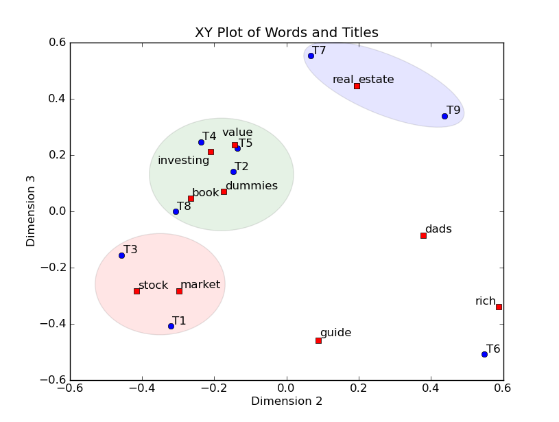
The Outcome
Tada! Here is our result. Each point represents a document in two dimensions taken from our transformation and colours are the classifications of document groups I described earlier. The numbers correspond to document names, which again have been anonymized here, acting as an index. The big red diamond is the primary document which the others should be related to.
# Classic Multi-Dimensional Scaling for Graphing
ggplotly(ggplot(full,aes(x=x, y=y)) +
  theme_bw()+
  geom_point(data=full[1,],aes(x=x, y=y),size=2.5,color="#FF0000", shape=5) +
  geom_point(data=full,aes(x=x, y=y, color=full$Classification)) +
  theme(legend.title=element_blank())+
  xlab("Dimension 1") +
  ylab("Dimension 2") +
  guides(guide_legend(title="Document Classification")) +
  geom_text(data=full,aes(x=x, y=y-0.2, label=row.names(full))))%>% config(displayModeBar = F, autosize=T)
An addition we can add is an ellipses for each document group to show their ‘area’ of similarity (here represented at a 95% confidence interval). What we would expect to see is the big red diamond in the centre of the other documents and at the intersection of all the ellipsis.
If you want the full working script linked to working data click here
Conclusions
As we can see the primary document is not in the middle, but is not terribly far from the others and does relate to three of the five document categories. We can draw an inference that the primary overarching document that is supposed to tie all others together is not quite hitting the mark, but might only need tweaking, not a complete rebuild. We cannot definitively conclude the primary document is or is not similar because there is still a lot of variables at play that effect the analysis. I put them into two board classes:
Semantic Content- Above I referred to the assumption that documents should use similar language throughout. If that assumption is broken, we can start to see false negatives appear. Andri Mirzal gives the example of the synonym problem to highlight this. The word ‘growth,’ if that was a primary word to search for, is swapped for synonyms like ‘increase’, or ‘multiplied’, the analysis will say these are not similar, despite a human judging them as the same. A way to overcome this issue is to build a sophisticated lemmatisation analysis as part of the text pre-processing. Lemmatisation identifies the root of words and changes them within the dataset such as ‘studying’ and ‘studies’ shortened to their root ‘study.’ This allows more text to be directly comparable at the cost of semantic diversity.
Document Structure- This issues relates to the actual layout of your text. Technical documents tend to have more paper elements, such as section numbers, titles, footnotes, etc. Marketing documents are usually simple, more fluid and fewer in words but might also rely on photos for context which our analysis cannot capture. Again, a simple piece of marketing literature might be the result of a technical diagram, but due to the disparity in density of content the LSA analysis may determine the texts are not highly related. The only real solution to this issue is to again focus on the pre-processing of text to capture and remove the noise of documents to try and make texts comparable. However, if you over cut from a document are you comparing like for like? It’s a hard line to walk.
Final Thoughts
Text analysis has many different applications and branches. One point that I came to early on in my learning of these techniques is how important human intervention and supervision is in getting it right. Language is not a static or functional technology in that there is no A to B journey. Even the simplest sentence can be written and rewritten in a myriad of ways that communicate the same information.
I recommend anyone, who has the time and stamina to do so, read Jughan Heaberhaus’ Communication and the Evolution of Society. Heaberhaus focuses heavily on language as the starting point for his evaluation of social theory. He highlights that it is a miracle that humans can understand each other and that our languages work so well given how imprecise, nuanced and fluid they are. I could not agree with him more and that must be a consideration of any text analysis construction.
While not particularly robust in analytical content I have demonstrated the highly visual and easy to access potnetial of this mehtod. If you are dealing with non-technical consumers this is a great visual to get them talking and asking serious questions about their data, further analysis and solutions. There are also countless other ways to use our exisitng matrix transformations for that allow for future decision-making. I hope you enjoyed the journey of this technique. I look forward to hearing about your applications in your work or hobbies and please, let me know if you have any ideas or any changes that you can recommend.